Redesigning &Charge App: Design System + Wallet & Charging Features
A case study on scaling visual quality and UX flows in a European EV app
How I helped &Charge — a fast-growing European EV charging app — evolve from an inconsistent UI into a modern, scalable, user-friendly product.
Project context
&Charge helps EV drivers find charging stations and earn rewards.
The app had grown quickly (~50–60K active users) but, after 5 years, it suffered from inconsistency, poor usability, and lacked a design system — all while preparing to launch serious features like a digital wallet.
My role
I independently owned the UI assessment, redesign, and design system. I also co-designed the user flows for the new wallet and charging features — working closely with the founder, who had 5+ years of user behavior insights.
Independently led:
UI assessment
Full redesign
Creation of the design system
Collaborated on:
Feature flows (wallet, charging) with the founder
Redesign strategy
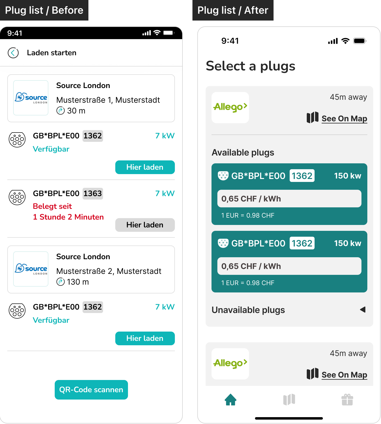
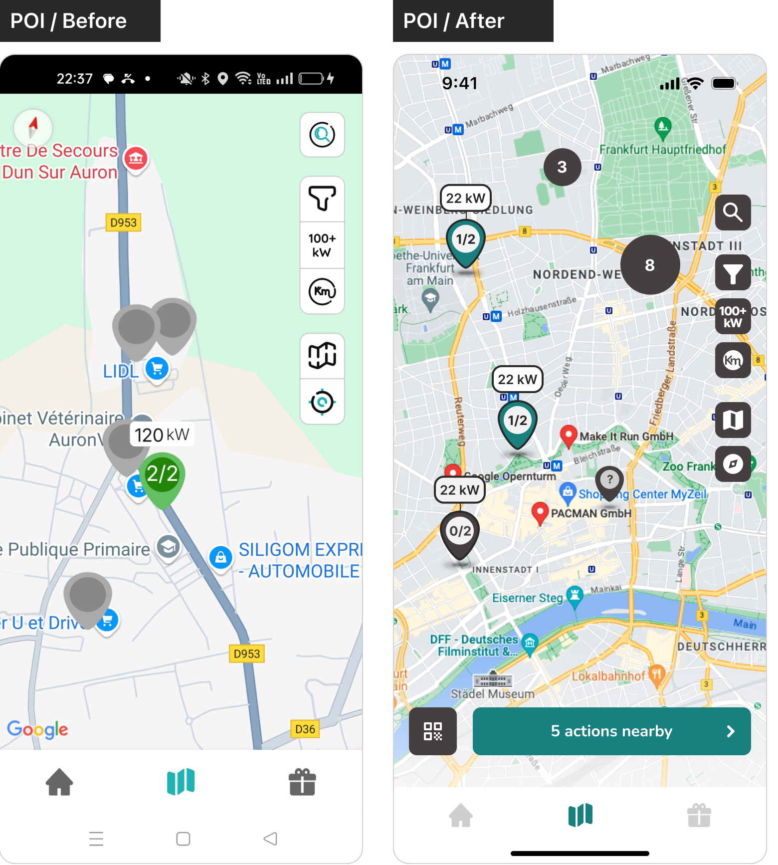
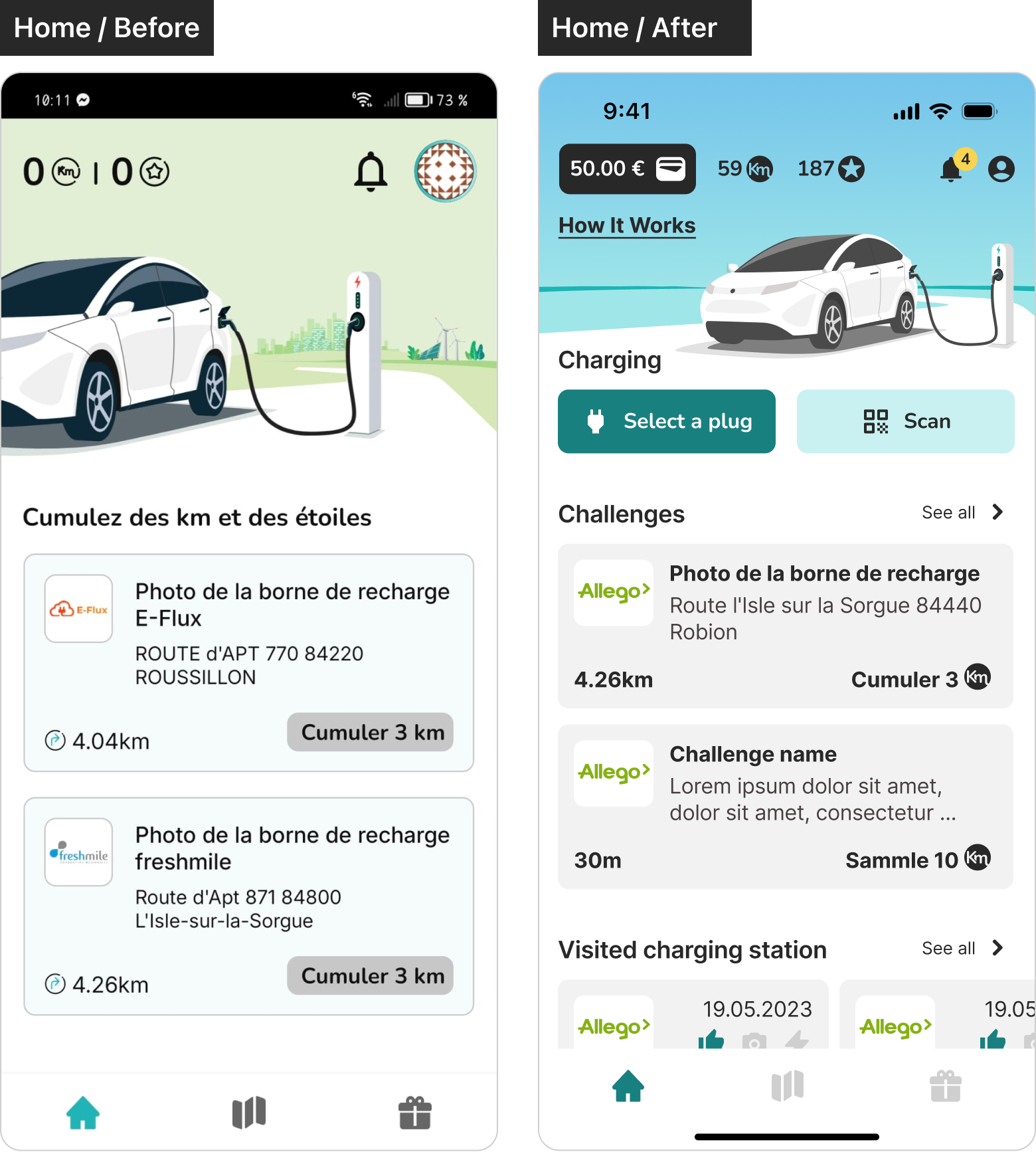
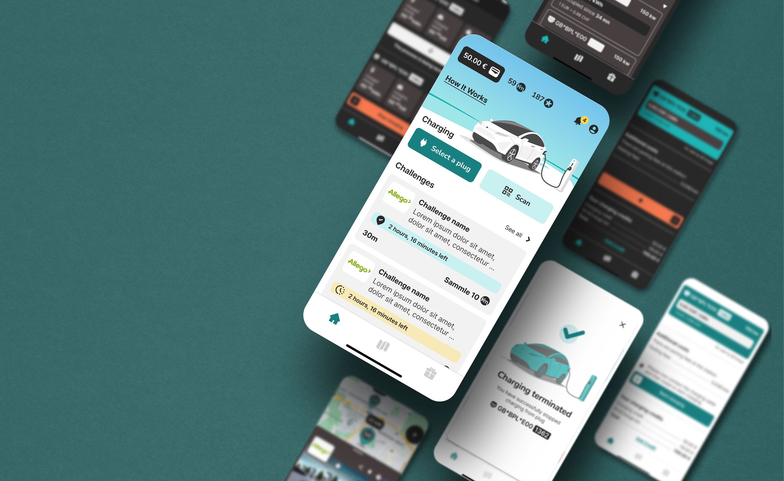
The redesign brought clarity and consistency. I replaced childish visuals with a more trustworthy style, established clear typographic hierarchy, and aligned all screen layouts with a new system.
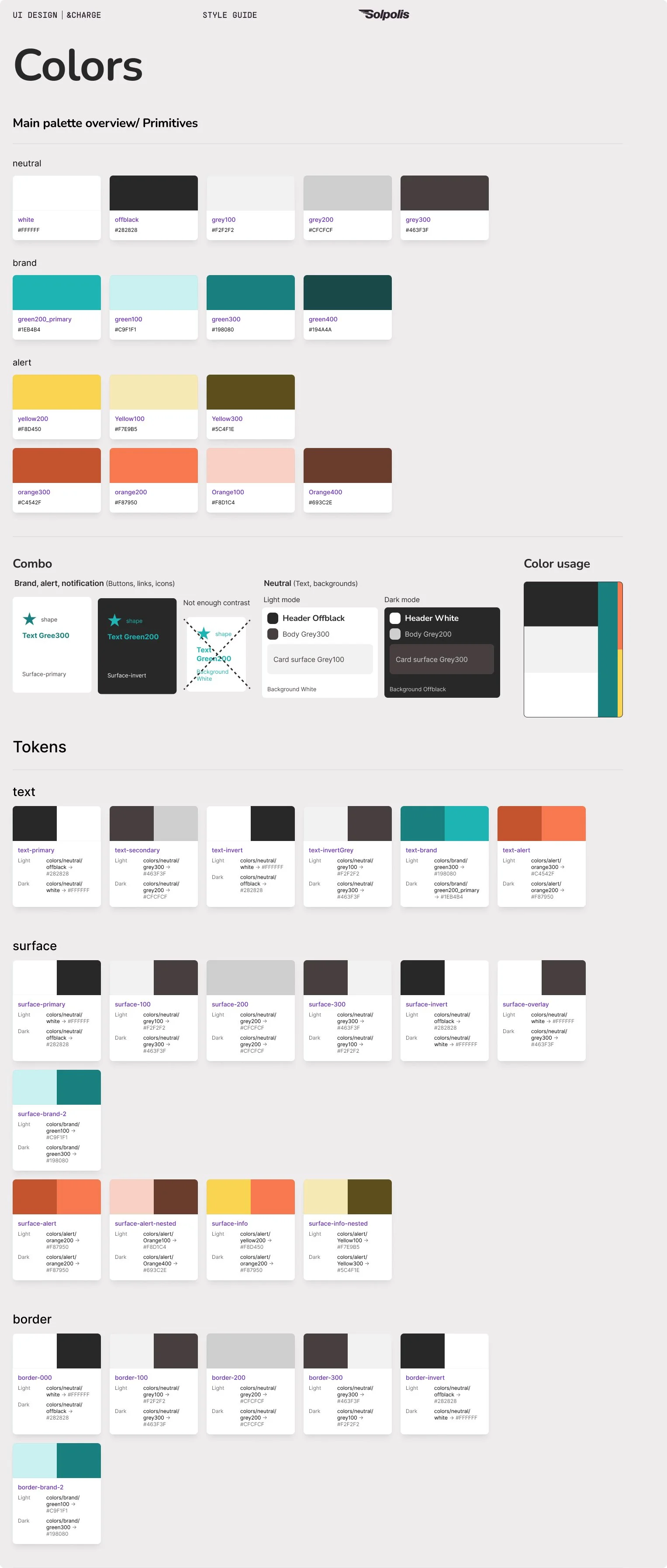
Reworked typography, brand colors, spacing, hierarchy
Updated illustrations and icons to a more mature style
Improved visual balance and accessibility
Screens: Home, POI (localizing and finding info about charging stations) tasks , Wallet tasks, Charging tasks
Design System: foundations & components
Scalable system for future-proofing:
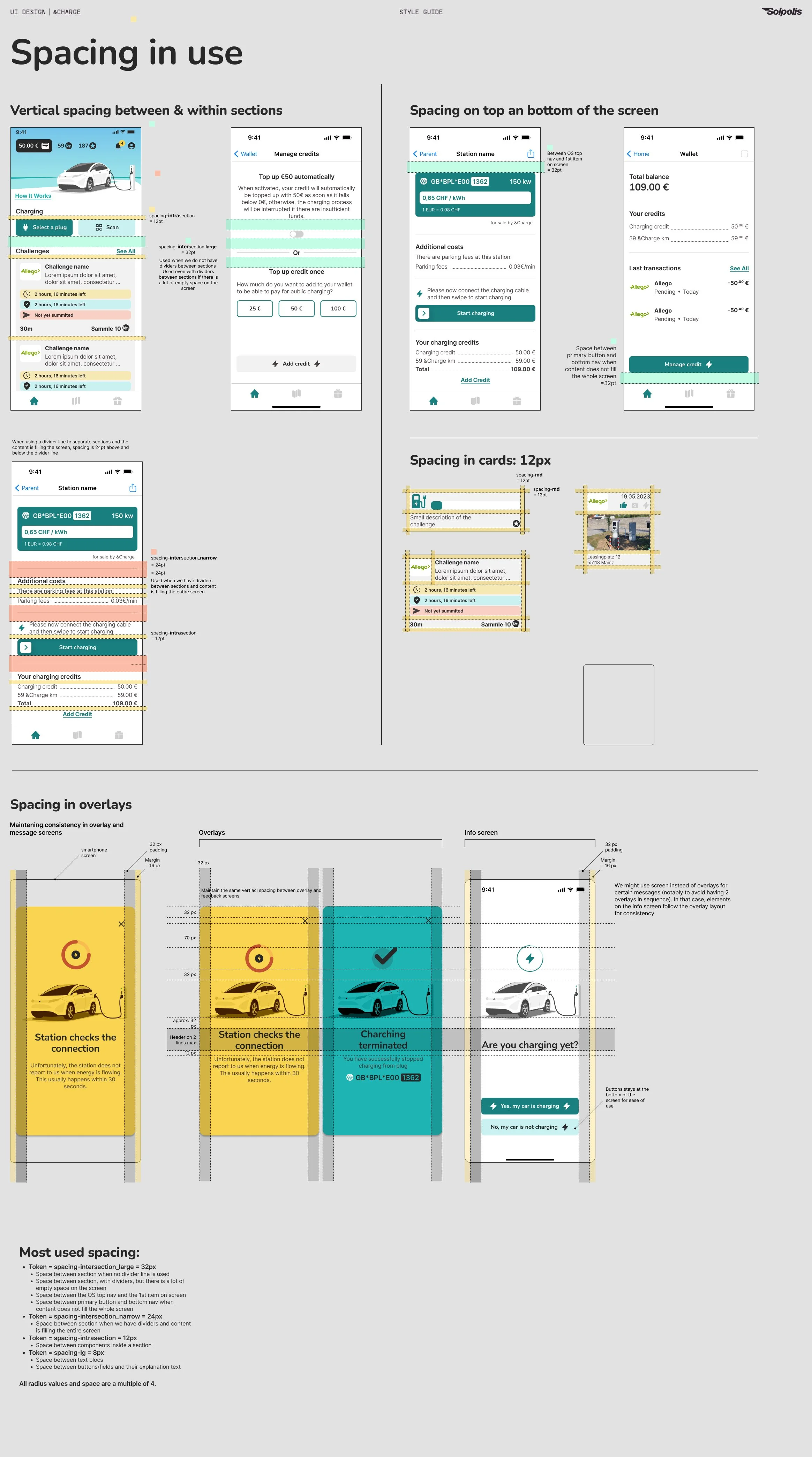
Grid system, spacing & color tokens
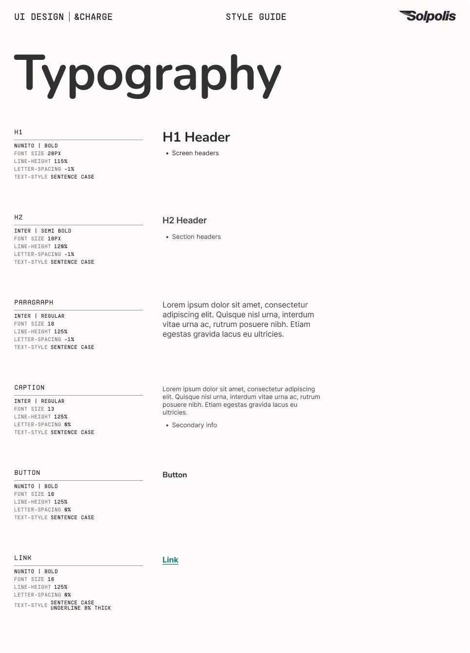
Typography styles (headers, paragraphs, captions)
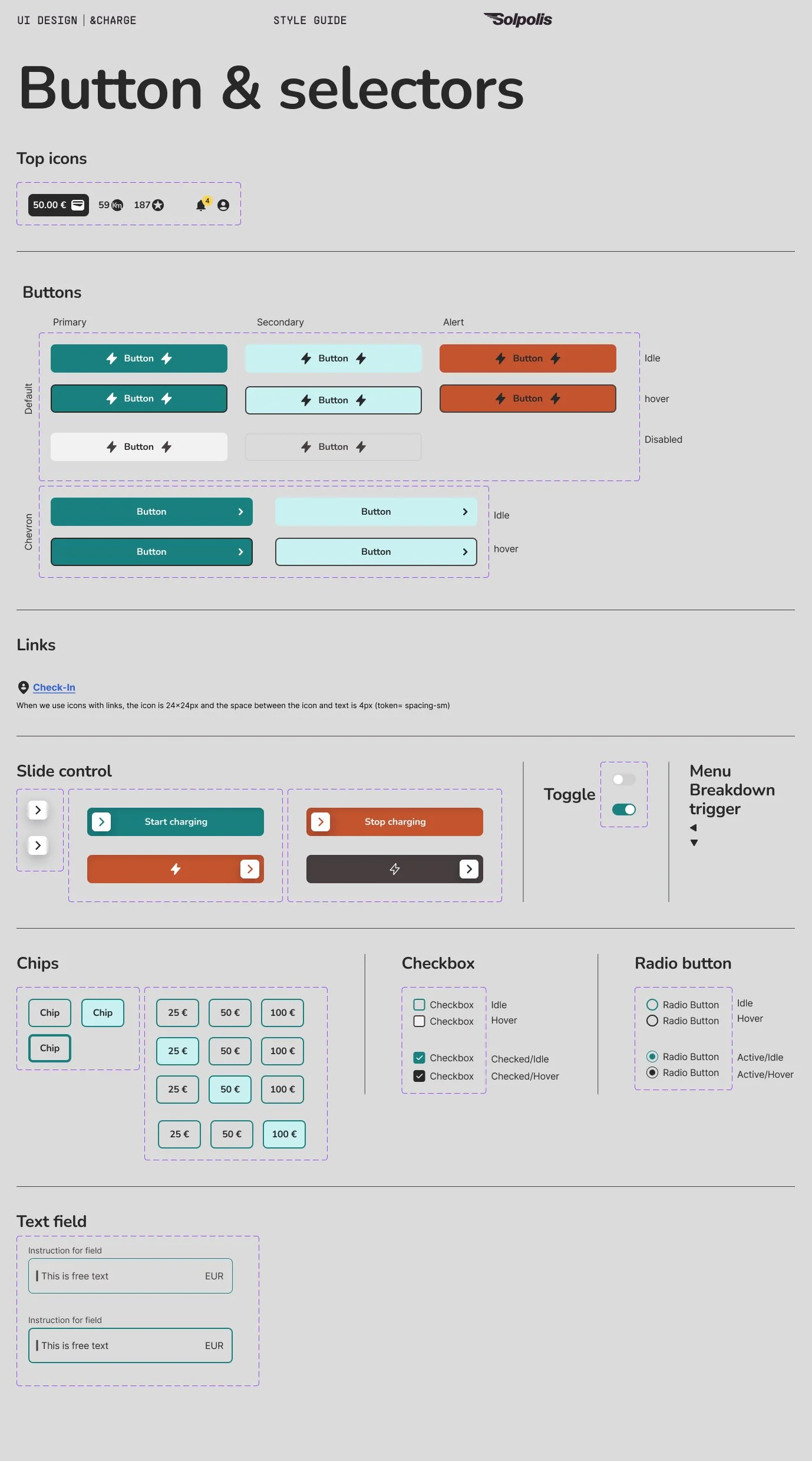
Standardized components: buttons, inputs, cards, overlays, toggles
Developer-friendly specs for handoff reuse and scalability
I built a complete design system: spacing tokens, color modes, typography, motion, and all major UI components. This gave the developers a solid base — and gave the product room to scale without future design drift.
Motion & Interaction
I defined micro-interaction rules and motion specs that helped bring the UI to life. It improved feedback, flow clarity, and kept consistency in motion.
Defined and documented easing curves, timing, triggers
Overlays and screen transitions
Action success, feedbacks and microanimations
Motion book: [open POI info overlay] motion details for developers
Motion book: [Expand card] motion details for developers
UXUI for new features
Charging Feature Flow
Credit management & payment integration
Add/top-up credit
Auto top-up option
Convert km points to cash
Transaction history
Fallbacks for insufficient funds
The wallet feature required trust and clarity. The flow was co-designed with the &Charge founder, who brought extensive user knowledge and technical constraints based on his research and conversations with their API vendor. I translated those insights into an intuitive UI — with safeguards like top-up alerts, visible balances, and transaction breakdowns — to ensure users felt confident and in control.
Wallet feature flow & screen design
Enable charging directly from app
Select plugs form POI map or QR scan → Connect → Swipe to start
Live charging status (duration, cost, kWh)
Visual feedback for charge errors or completion
The charging flow was co-designed with the &Charge founder, who contributed valuable behavioral insights and technical details from the charging infrastructure provider. Together, we shaped a guided sequence — from plug selection to swipe-to-start — focused on reducing user anxiety through clear feedback, success confirmations, and fallback messaging.”
Outcomes & result
Modern, consistent UI that better reflects the brand’s maturity
Reduced future tech debt by creating a reusable, documented design system — enabling faster feature rollouts and lowering maintenance costs as the platform scales.
Payment and charging flows that instill trust and reduce friction
The final result: a professional, scalable design system, stronger UI consistency, and flows that users trust. The design system gives developers a reliable foundation — eliminating the need to rethink the UI for every new screen.


“I worked with Arnaud for two months. During this time, he not only optimised the app's UI design, but also created a style guide and made numerous UX optimisations.
I would particularly like to highlight his ability to think creatively while working in a very structured manner. Arnaud is also very communicative, open to feedback and was always responsive.”
Eugen Letkemann
CEO & Co-Founder. &Charge
Reflections & Takeaways
I deepened my ability to collaborate, align with product goals, and build systems that support both users and developers. Collaborating closely with the founder was a valuable learning experience. His user knowledge and direct input from API vendors added depth to the design process. I focused on translating complex input — constraints, goals, and founder insight — into clear, user-centered flows. The project reinforced my ability to align design with strategy and scale.
This project reinforced that post-MVP design is not about adding complexity — it’s about building scalable systems that enhance user trust, support product growth, and make future development faster and more efficient.

